Orthofi

Orthodontist Web Application

DotsDots

Years ago, two of the industry’s most innovative orthodontists wanted to take their respective practices to a new level.

50%

Reduction in call volume

10%

Decrease in urgent eligibility check rates

1,226%

Revenue growth over the past three years

Devetry was selected as a strategic development partner to fill a technology leadership gap for OrthoFi. With an entirely local presence and strong culture fit, the partnership felt like a natural match.

Ultimately, OrthoFi praised Devetry’s end-to-end ownership and accountability. When development issues arose, Devetry was able to own the delivery of product and provided prompt deployment support.

The problem

Together, Devetry and OrthoFi set out to tackle three major problems. First, the existing payment slider was six years old and needed to be updated to meet evolving user needs.

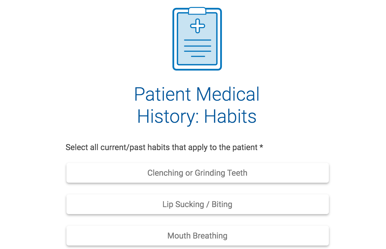
Secondly, the front-end intake process needed to be streamlined and optimized to functionally shorten treatment time. As it stood, filling out intake forms was confusing and redundant, holding up patient registration.

Finally, most people were trying to fill out forms on their phone, but the platform was not mobile-friendly, which meant a clunky experience.

All three things needed to change if the innovations that had been made in treatments were to be reflected in the actual patient experience.

DotsDots
01

Slider 2.0

02

New Patient Forms

03

Mobile Friendly

New & Improved

Payment Slider 2.0 was conceived to offer up increased self-service, plan clarity and customization, and an updated UI on a modular technology platform.

To bring self-service to the forefront, the treatment plan breakdown needed to be more transparent for patients. Payment Slider 2.0 outlined a clear breakdown of total cost owed by the patient, including down payments, monthly installments, and additional courtesies, and a variety of payment options.

In order to customize plans, treatment coordinators at the orthodontist office were empowered to handle claims directly for the patient, rather than calling the OrthoFi Customer Care Center to “approve” or “deny” custom requests. Making the plan more customizable for office staff lowered calls significantly, and contributed to reducing the overall call volume by 50%.

New & Improved

Payment Slider 2.0 was conceived to offer up increased self-service, plan clarity and customization, and an updated UI on a modular technology platform. To bring self-service to the forefront, the treatment plan breakdown needed to be more transparent for patients. Payment Slider 2.0 outlined a clear breakdown of total cost owed by the patient, including down payments, monthly installments, and additional courtesies, and a variety of payment options. In order to customize plans, treatment coordinators at the orthodontist office were empowered to handle claims directly for the patient, rather than calling the OrthoFi Customer Care Center to “approve” or “deny” custom requests. Making the plan more customizable for office staff lowered calls significantly, and contributed to reducing the overall call volume by 50%.

Easy to Use

To help expedite appointments, OrthoFi’s online patient forms could be completed in advance of service. Through user research, however, it became evident that the forms had redundancies, and could be more streamlined and easier to use. A UI overhaul would better meet user needs and reduce the time it took for patients to complete the forms. Additionally, the forms’ flow of questions was updated to be more intuitive, with the addition of better filters so that only relevant questions were asked. Pages were shortened and a progress bar was added so users would know when they were close to completion.

A Better Experience

OrthoFi knew that many people were trying to fill out the new patient forms on their phones. However, the forms had been optimized for desktop computers, making for a poor mobile user experience. The updated design was made to be mobile and tablet responsive. If the patient hadn’t completed their forms before coming to their appointment at the office, they could now pull them up on the office tablet to complete them. Creating a mobile version (versus using the desktop version on mobile) also laid the foundation for additional mobile functionalities (e.g. text messaging) to be added as user needs evolved.

Working with Us

All the new changes that Devetry and OrthoFi had partnered together to implement made it so orthodontists could focus on straightening teeth, office staff spent less time on administrative work and contacting the insurance companies, and patients now had “same-day starts,” the ability to fill out forms quickly and easily, and access from any device.

Left

01

/01

Right
Background

Results

After launching, the Payment Slider 2.0 was given 4.4 out of 5 user rating and the new patient forms were given a 4.5 out of 5 user rating. The forms also helped decrease OrthoFi’s urgent eligibility check rates from 30% to 20%.

In 11,000 completed surveys, patients said they “appreciated the convenience” of the new forms, adding, “We loved this! So much better than printing a ton of pages!” And they also applauded the new mobile platform, “Now I can do it on my phone!”

John Truchel

VP of Product

“Devetry’s developers thought like product people. They asked questions that a product manager would ask, demonstrating to me that they were more than just software engineers, but true product partners.”
Background