Why Healthcare Has Historically Poor UX/UI (and how to fix it)
Design
2022-05-09T19:25:56.701Z
Share


Share
There is a general consensus among designers that healthcare software, websites, and applications are unsightly and difficult to use.
Their user interfaces typically look dated and cluttered. Their user experiences are confusing and overwhelming. This UX/UI problem goes beyond looking “old.” Rather, software applications in the healthcare space provide less value and effectiveness across their core customers compared to other industries.
Why is this? What makes the healthcare industry the standard for poor UX/UI?
As we asked ourselves this question, we realized that it’s complicated. Healthcare products and services are dealing with challenges and restrictions not observed in other industries.
However, even though they face more challenges, there are some tried and true methods that UX/UI designers should take into consideration.
Let’s first start with why healthcare has his historically poor UX.
Challenges for Healthcare Technology
Here are some of the most common design challenges facing healthcare brands today.
Accessibility & Compliance
![]()
Healthcare products and services have to be web-accessible and compliant.
It’s challenging to be accessible and compliant while having a creative user interface.
One massive limitation in regards to healthcare websites is that sight-impaired users need to be able to use the app or website. To cater to these users, your website and app need to be designed so users can navigate to all clickable items using the tab button on their keyboard. This alone rules out some unique functionality and hinders creativity.
2009 HITECH Act
The 2009 HITECH Act was the original legislation that required the use of electronic medical records and the 2012 EMR mandate, a part of the ACA, doubled down on that requirement. This act was well-intentioned, but in reality, people with zero technology background went out and purchased the first piece of software they could find to bring them under compliance.
This resulted in massive consolidation under a few vendors with prioritization of compliance, not user experience.
Fast forward to the present. Now that these software vendors are entrenched in hospitals and other practices, they’ve become a gateway to medical data, and they’ve done everything they can to limit access to that data and keep other players (with potentially better UX) out.
Desire to be Seen as Safe
In general, healthcare brands want to be seen as reliable and trustworthy. Therefore, they don’t have the motivation to push the UX/UI envelope like a new product does. If these sites or apps look too trendy, they may be seen as less credible by some users.
Similarly, many healthcare brands are used to designing for seniors who may prefer an old-school interface.
Information Baselines
Some healthcare products have so much pertinent information, they don’t have the resources or time to think about design (think heavily-regulated pharmaceuticals or medical supplies). They use most of their resources and budget on what’s legally required of them, leaving none for strategizing an online user experience.
Clinician-Focused
Last, clinicians may need to access healthcare websites or applications from hospital computers, which are often old machines with their own set of limitations.
Each of these challenges is difficult enough on their own, but when you combine them, suddenly you realize that healthcare product managers and marketers face an uphill battle.
Strategizing UX/UI in Healthcare

So we’ve acknowledged that healthcare teams have their work cut out for them when it comes to providing a friendly experience to their users. But despite it being more difficult than other industries, providing a good user experience and user interface is still essential.
Luckily, there are a handful of best practices and initiatives that you should be able to tackle even if you have strict requirements. Here are the top things you can do to improve the UX/UI of your healthcare software.
Know Your Audience
Are your users medical professionals, regular people, or both? Are they accessing you via mobile device or 2005 Dell desktop? Understanding these nuances will help you strategize the best way to display relevant information.
For every demographic and user preference, there is a subset of considerations. Consider things like portals, decision trees, size of elements, and messaging.
Cognitive load
Are your users ingesting too much information too fast? Too much information overloads the senses and creates confusion and abandonment.
In other words, don’t have too much information on a single page. Use tabs, links, and videos to communicate clear messaging. A slow drip of information and one-at-a-time functionality is best.
Information Architecture
How do you structure your website or application so that users can find exactly what they’re looking for? We often see healthcare websites and applications with confusing information architectures.
To fix this, consider breaking your content out into simple categories and then determining the best ways to logically sort and order that content. A great way to do this is through a card sorting exercise. Then test your first iteration on real users.
Consistent Design
A general UX/UI best practice, be consistent in your designs. Beyond brand colors, consider things like buttons, UX/UI across devices, sign in, and support. For example, buttons should always look like buttons to establish patterns and expectations.
User Flow
The step after information architecture is user flow, which figures out ideal travel pathways throughout your app or website. This is a relatively simple thing you can do to improve your user’s experience. Use analytics tools to track current user flows, compared to ones you’ve decided are ideal. Where are users getting lost? Start there and work outward.
Prepare for the ONC Cures Act
The ONC Cures Act passed in March 2020. Once implemented, it will shake up the healthcare industry quite a bit.
The ONC Cures Act calls on the industry to start prioritizing interoperability through APIs (particularly using the FHIR standard). This will let new technology entrants communicate with practices using more modern tools than a fax machine. With this new ability, newcomers will have more opportunity to grab market share, and force “old school” providers to improve their user experience — or fall behind the market.
Healthcare Companies With Excellent UX/UI
Dispatch Health
The reason we enjoy this UX/UI is that it’s simple, even though their product is not. They use best practices in information architecture, cognitive load, and messaging to ensure that users can easily sign up or request healthcare services.

Ease Central
Ease Central is used mostly by new hires to enroll in benefits. It’s an essential touchpoint that has a reputation for being bulky, but Ease had figured out a way around that. For Ease’s users, it’s easy to sign up and in, the dashboard prioritizes information, and there’s not an overload of choices.

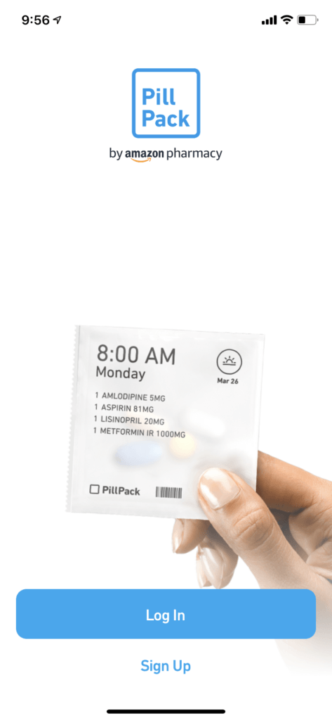
PillPack
PillPack is a product powered by advanced databases and APIs, however, they keep their UX/UI simple. They utilize user flows, clear information, and consistent design to improve their UX/UI.
Designing a great user experience and interface for a healthcare product or service is difficult. There are many restrictions across websites and applications that need to be taken into account. However, dedicating resources to improve UX/UI can increase your users, reduce costs, and expand your audience. The opportunity for positive ROI is clear for a number of new-age healthcare products and services.
Contact Devetry for UX/UI design services. We can help you research, strategize, and execute a healthcare-focused website or application.

